The Artist Project
We designed an identity and a website for The Artist Project, a web series produced by The Metropolitan Museum of Art, which asks contemporary artists to respond to an individual work of art or gallery in the Met that sparks their imagination. The series comprises six seasons, each of which has 20 episodes and is released all at once, Netflix-style.
-
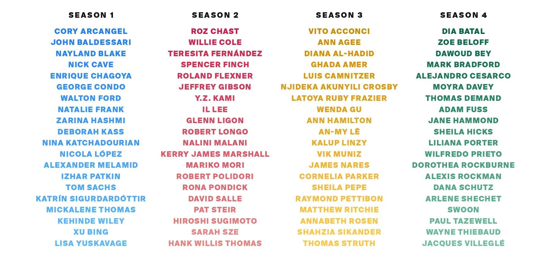
The artists so far. Each season is assigned a color gradient, and each episode within a season is assigned its own color along that gradient.
Although it’s a sort of sequel to 82nd & Fifth, the Met’s series from 2013 starring curators from the Museum talking about their favorite works of art, we wanted to distinguish The Artist Project from its predecessor both visually and as an interactive experience. The first and most obvious way to do this was to turn on the lights: unlike the black-backgrounded 82nd & Fifth, The Artist Project is presented on a clean, vast white space. This decision extends to the episodes themselves, which are loaded onto the site using Vimeo’s API. At the end (or beginning) of each episode, photographs fade to (or from) white rather than black.
-
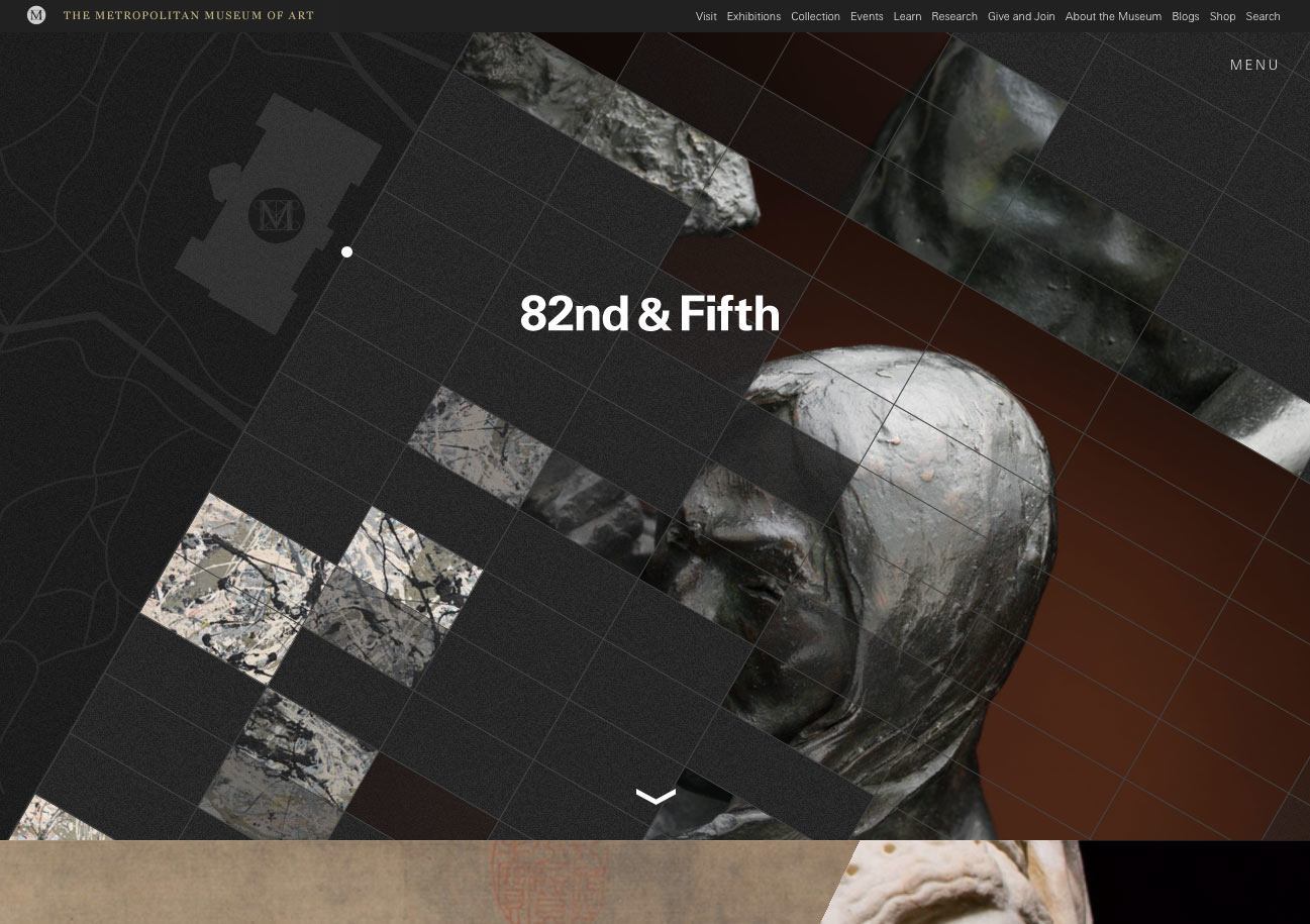
82nd & Fifth homepage
-
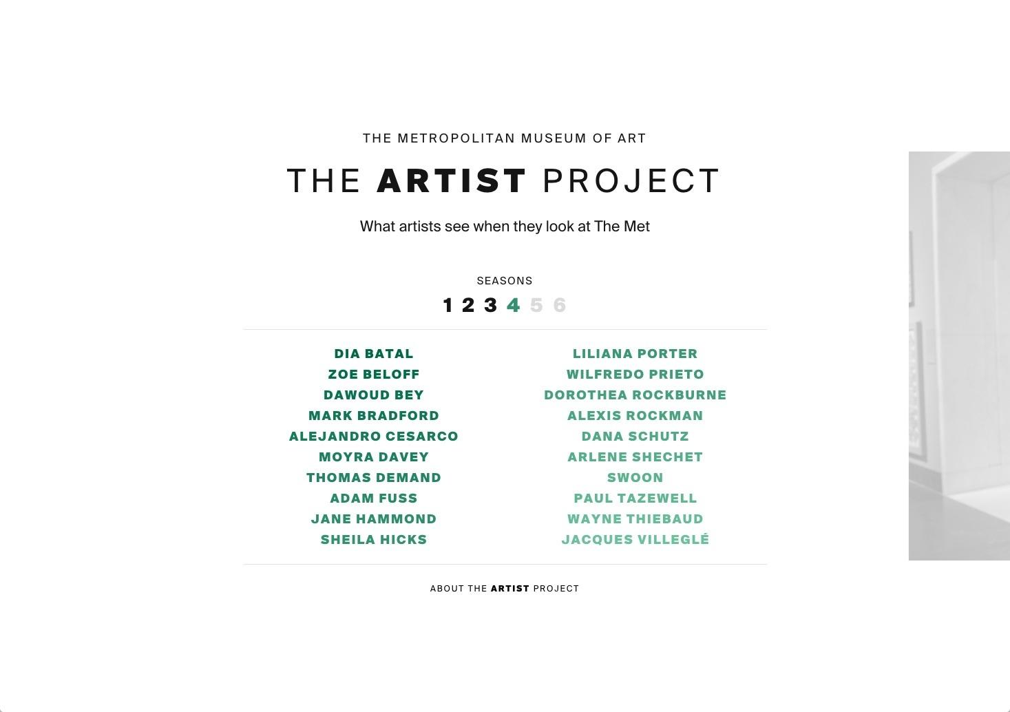
The Artist Project homepage
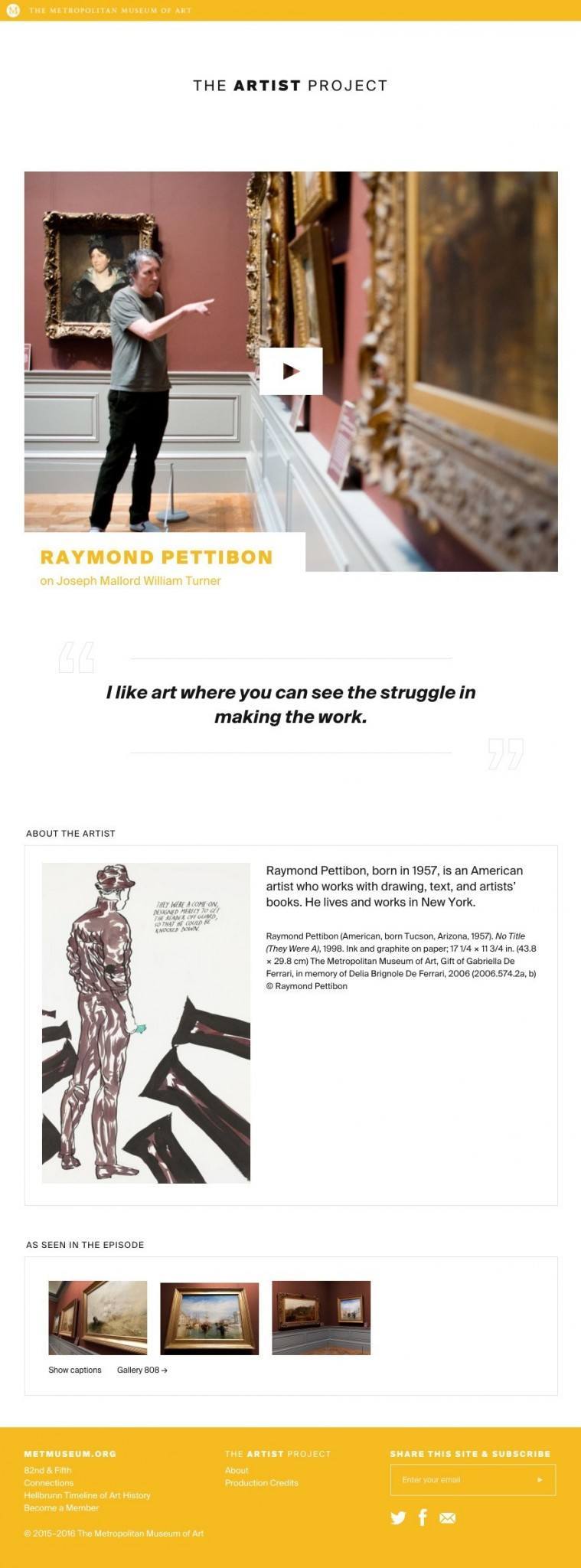
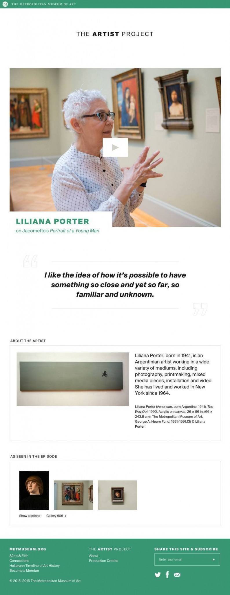
Users navigate by clicking on the left or right side of the screen, where the previous and next episodes are teased. To get a comprehensive look at all of the episodes in the series, one can access the full-screen overlay menu, or click the logo at the top to return to an overview of the current season. The navigation, and the episodes’ preview images, emphasize the artists’ names and likeness instead of the topics they discuss.
-
Clicking through the site
Each episode’s opening title sequence is built into the code of the site. When a user hits the play button, the artist in question begins to introduce herself. Ancillary page elements fade from view, and the white bar, with the episode title inside, rises to meet The Artist Project logo, which appears right on the ding of the theme music. Then, the title elements disappear, and the episode grows to fill the page. (Well, it almost fills the page. In order to imbue the episodes with the same light, airy quality possessed by the rest of the site, we present them with a generous white border.)
-
Playing an episode
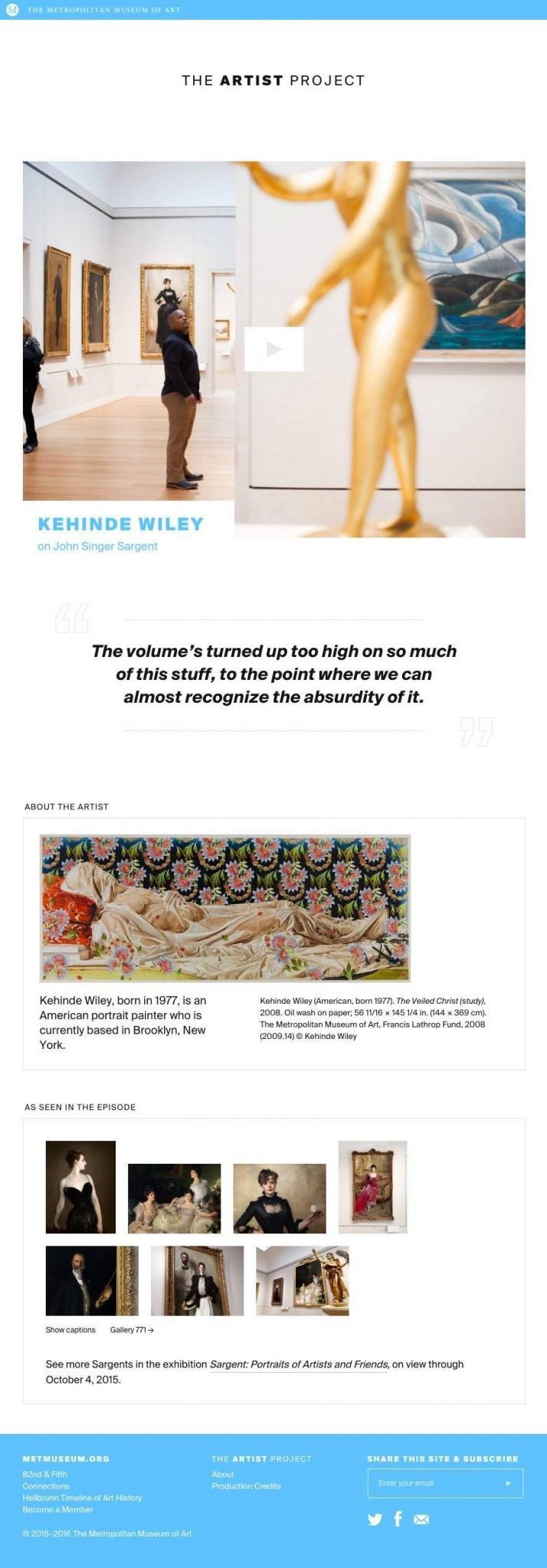
If a user wants more information about an artist or the work featured in an episode, he can simply scroll down on an episode page, where he’ll find a short bio, an example of the artist’s work, and links to entries in the Met’s Collection for each work featured in the episode.
In addition to the site itself, we have a hand in most of the marketing materials that support it. Of particular interest are the teaser videos we animate for each season.
-
Season one teaser